
In this map, shading is used to show the worldwide consumption of beer by country. (Courtesy UCSB)

This map shows the varying prices of a pint of beer throuhgout the world.

This map shows gallons of beer consumed per capita in the the US 2017.
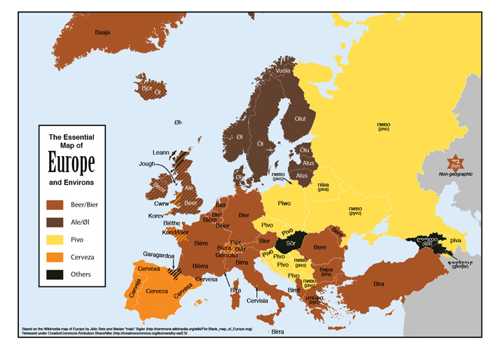
This map shows the differing words for "beer" throughout Europe.

This map shows the most popular/most likely to be on the menu state by state in the US.

This map shows the distribution of craft breweries throughout the US in 2015.

This map shows how much of a share beer had of total alcohol consumption by country in 2010.

This map shows the 2014 worldwide data of beer consumption per person (liters)

This map shows state beer excise tax rates by state, et al 2011.
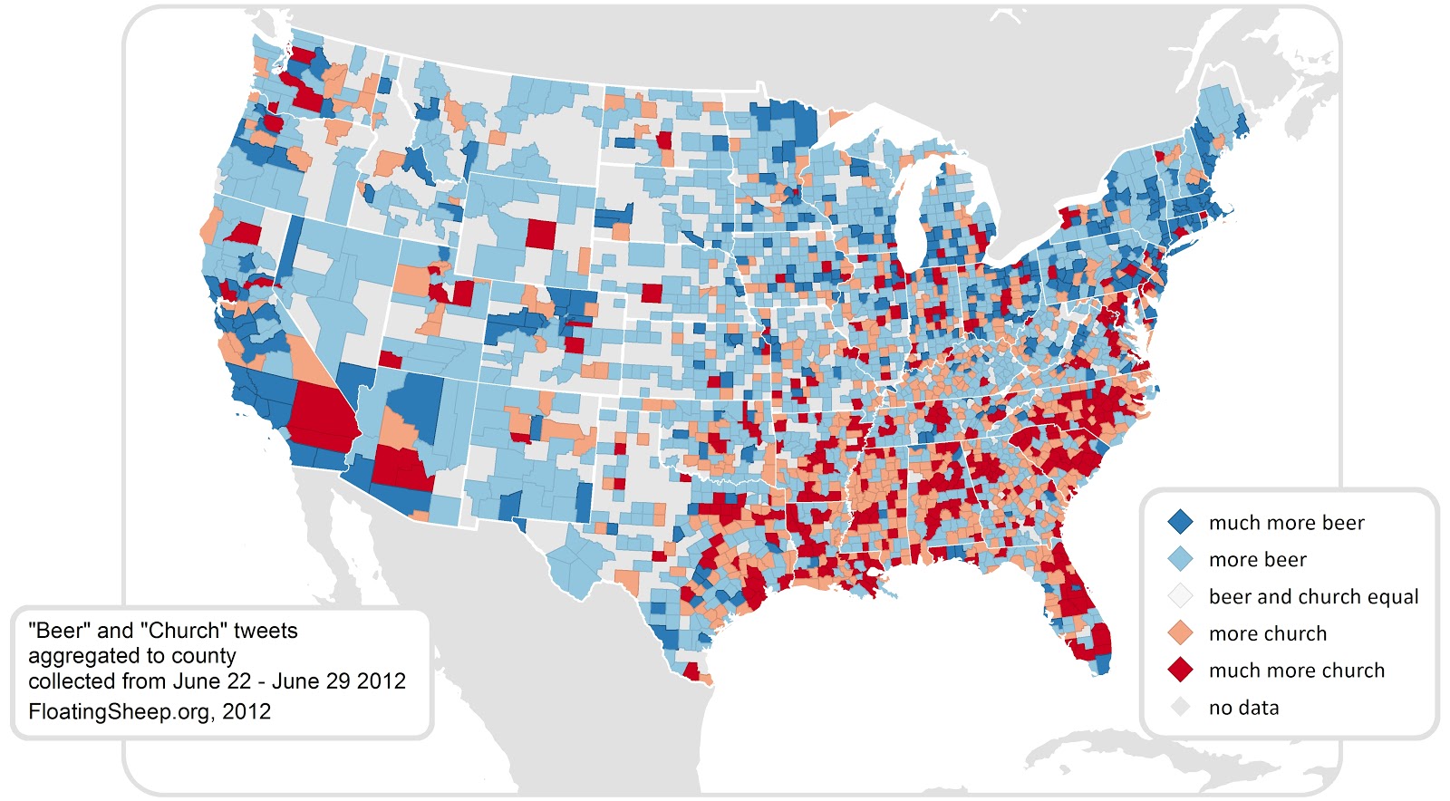
This map shows the usage of the words "beer" and "church" by state, 2012
Produced by Maren Saddler